A room should never allow the eye to settle in one place. It should smile at you and create a fantasy.
We have all always struggled with deciding on a colour or a theme when it comes to redoing our homes and interiors. So we decided to make it a little easier for you all to pick a favourite. Here is a collection of the most popular selection of colours used on Instagram and different interior inspiration and décor ideas!
1. Black

Black is the go-to colour for most of us on days when we want to feel extraordinary about ourselves so why not do the same to the interiors of a room? Some beautiful accents in gold or maybe a pop of red or teal somewhere can do wonders to the interiors of a room done in black. Entertain guests in a dining room as the Sun cascades the onyx walls or have some great lighting over dinner that leaves the visitors in awe of the ebony décor pieces.
2. Peach

For a shade that is feminine yet not reminiscent of Barbie, peach is the perfect subtle tone. It has a certain charm to it and can be made to look gender-neutral yet, fabulous when teamed with a colour like grey. It is the perfect colour to welcome your baby home when clubbed with some charming décor pieces in grey and gold.
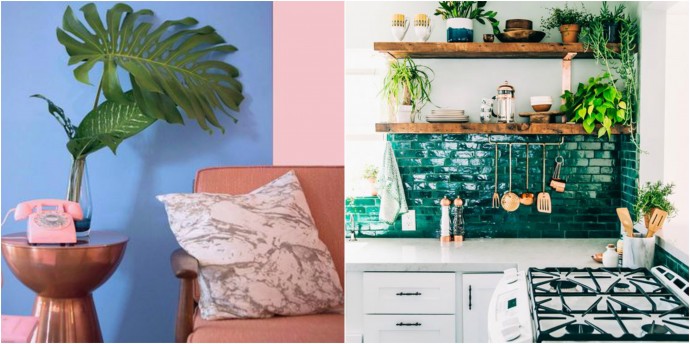
3. Teal

This colour is understated glamour personified. It is a colour that breathes life into a room, be it with the walls, floor, fittings, furniture or the display pieces. Even if we just add accents of teal in an otherwise bland room, it can liven it up and give it an entirely different appeal.
4. Gold

Now obviously nobody wants to look like they are within the walls of a pyramid, but gold is a very obvious head-turner when it comes to décor if done tastefully. Textures like a marble panel or the floor that matches the tone of the gold fittings can dramatically make any space look posh and sophisticated. The key with gold is to have just the right amount of it in the right places, like in this powder room.
5. Green

Often associated with gardens and Slytherins, this colour can be a game-changer when it comes to interiors. Be it a fern green or a vivid shade of emerald. While walls in a shade of mint could give a fresh peppy feel, statement furniture pieces like these armchairs in a library can be just the right amount of magic a room needs. The nature lovers can always go with bolder, deeper shades of green on the walls, done in a tasteful manner, to give a sense of bringing the outdoors, inside.
6. Grey

Well, this word certainly reminds us of the ‘Red room of Pain’, but that doesn’t mean that the colour in itself can’t spell magic. Go mute this time; instead of the usual warm tones that we tend to pick for our kitchens, let us try some grey finishes and even a modular setup in grey such that the focus is on the details of the entire space and not just one particular colour or shape.
7. Yellow

We saved our favourite for the last! The Sparrow suggests using its most favourite colour to brighten up any area that could do with some cheerfulness. And what better place to start that than with home offices or the study! Some accents or heavy drapes in a bright summery tone can instantly lift one’s spirits and keep them going throughout the day!
Look no more and get interior inspiration for the upcoming festive season and give your homes a complete makeover with these Instagram popular hues!